Classic theme for your planner app
The calm of a paper planner, on a phone.
Your app already works. Ledger gives it the look of a well kept family book: ivory paper, navy ink, an oxblood accent and brass rules, with a serif for dates and names and a clean sans for everything you tap.
The phone is live. Tap the tabs, tick a task, open Quick Add.
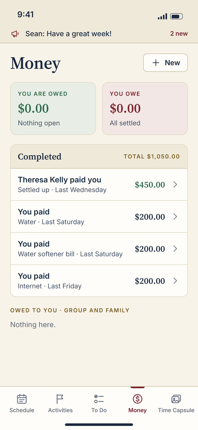
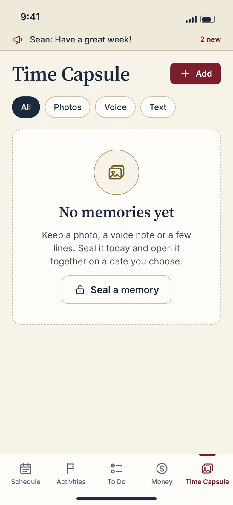
Six key screens
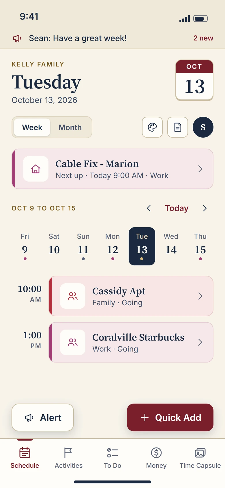
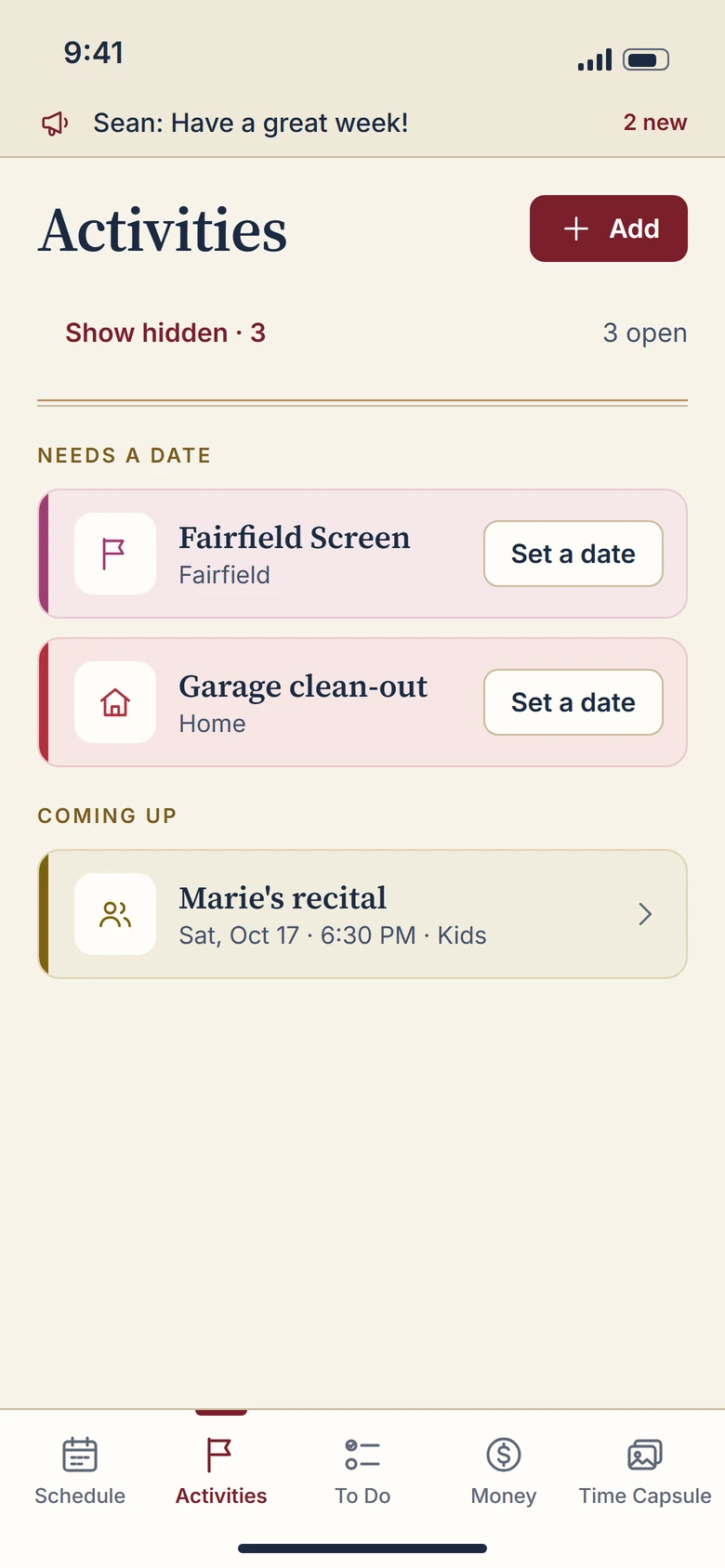
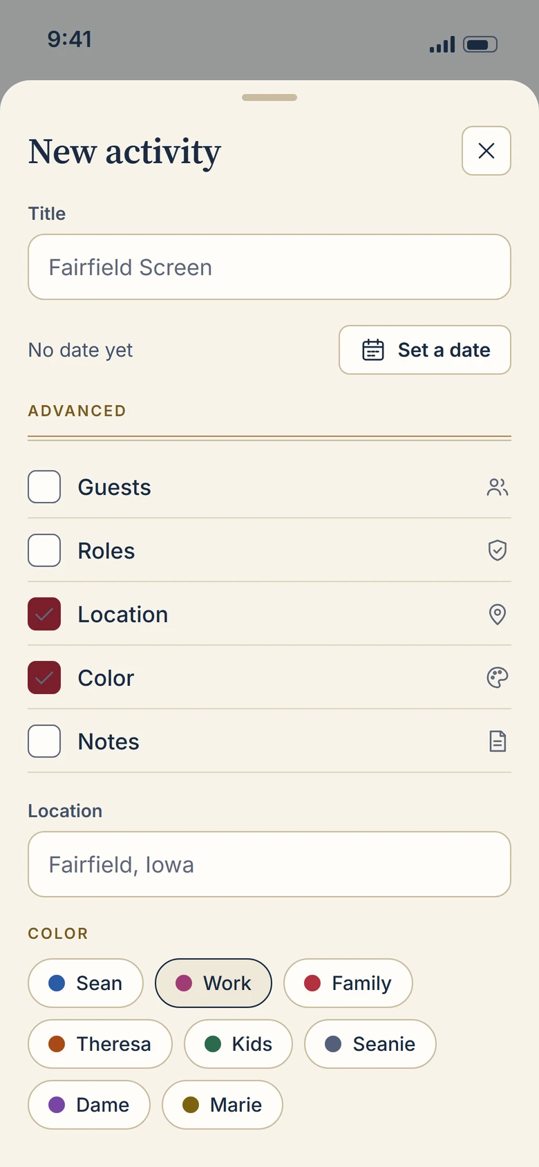
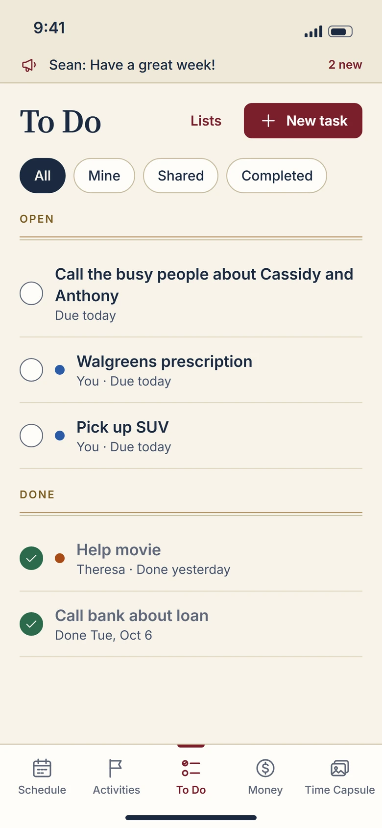
Your screens, same layout, new theme.
Every label, tab and field sits where your users already expect it. Only the surface changed, so your programmer can apply the components to the layouts you have.
Colour system
Twelve core colours, eight people.
Each pairing below is measured, not guessed. The number is the contrast ratio and every text pairing passes WCAG AA (4.5 to 1 or better).
Person and group colours
Your app tells people apart by colour, so all eight stay. Each one is tuned to carry white text and to read on paper.
Typography
A serif for what matters, a sans for what you tap.
Source Serif 4 sets days, names and money. Inter sets labels, buttons and body text. Both are free, open fonts that ship inside iOS and Android apps.
Components and states
Every control, in every state.
These are the real components running in the phone above, shown at rest, pressed, focused and disabled.
Icon set
Twenty-four icons, one pen.
Drawn on a 24 px grid with a 1.5 px line and round joins, so they stay crisp on high resolution phones.
Style guide
One theme on iOS and Android.
The rules your developers need to keep both apps consistent.
Shared
- Spacing on a 4 pt grid: 4, 8, 12, 16, 20, 24, 32.
- Screen margin 20. Space between sections 18 to 24.
- Corner radius: 8 small controls, 12 buttons, fields and cards, 16 panels, 22 sheets.
- Lines are 1 pt. The double ledger rule is brass over a soft rule, 2 pt apart.
- Colour never works alone: a person colour always comes with a name or an icon.
iOS
- Touch targets 44 by 44 pt or larger.
- Sheets slide up with a grabber and 22 pt top corners.
- Pressed state darkens the control. No bounce on buttons.
- Dynamic Type: the type scale grows with the user's setting, the serif stays for titles.
- Tab bar sits above the home indicator with the oxblood marker on the active tab.
Android
- Touch targets 48 by 48 dp or larger.
- Ripple in the pressed colour replaces the darken.
- Flat surfaces with rules. Shadow only on the floating Quick Add.
- The same fonts are bundled, so nothing falls back to Roboto.
- Bottom navigation uses the same five items and marker.
Hand-off
Ready for your programmer.
Every colour, size and radius is a named token, so the theme goes into code once and applies across all screens.
- Figma fileColour and text styles, components with variants, the six screens
- Icon set24 icons as SVG and PNG at 1x, 2x and 3x
- Design tokensOne JSON file plus Swift, Kotlin and CSS versions
- Style guideThe rules on this page as a PDF for the team
The full pack is released when the contest is awarded.
{
  "color": {
    "paper":   "#F7F3EA",
    "card":    "#FFFDF8",
    "ink":     "#1B2A41",
    "oxblood": "#7A1F2B",
    "brass":   "#B08D57"
  },
  "radius":  { "s": 8, "m": 12, "l": 16, "sheet": 22 },
  "space":   [4, 8, 12, 16, 20, 24, 32],
  "type": {
    "display": { "font": "Source Serif 4", "weight": 600, "size": 34, "line": 40 },
    "body":    { "font": "Inter", "weight": 400, "size": 16, "line": 24 }
  }
}